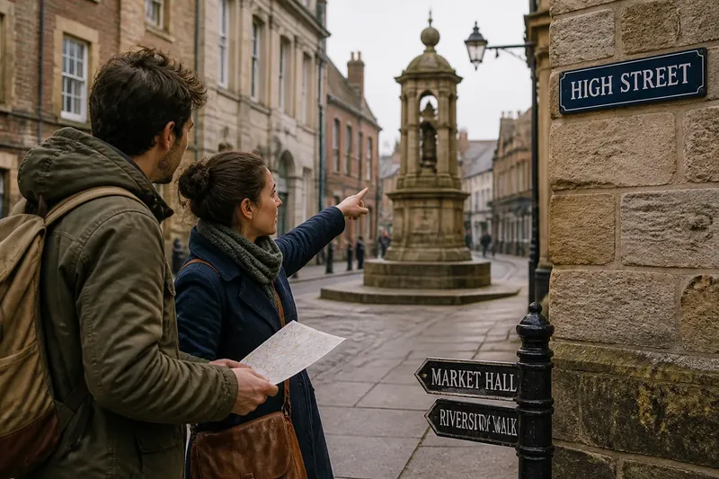
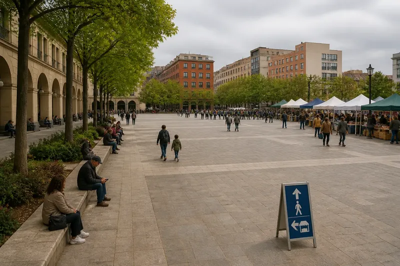
Why a Street Sign Needs Room to Be Seen
Street sign visibility depends on space, sightlines, and timing. Learn what helps a sign stand out before a turn or crossing arrives.
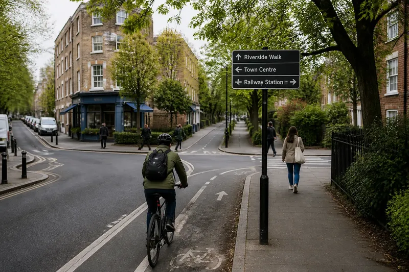
How much room does a street sign need to be read in time? Street sign visibility depends on more than a clear face: the sign must enter a person’s view before the decision point, stay legible amid nearby objects, and remain visible long enough to guide the next move. In a busy street scene, a few feet of visual breathing room can matter more than another line of text.
1. Start Before the Decision
A direction sign is useful only if it appears while a traveler still has a choice. A sign mounted beside a turn may be easy to see from the corner, yet too late for someone approaching on foot, cycling, or driving. The relevant question is not simply, “Can I see it here?” It is, “Can I see it early enough to act without a sudden correction?”
Placement should match the approach. A person walking has time to glance around and slow down; someone on a bicycle or in a vehicle needs information earlier, with less opportunity to stop safely. Sightlines also change with the street: a bend, a hill, parked vehicles, or a building edge can hide a sign until the route decision is close.
Imagine a visitor walking toward a fork in a neighborhood path, with a sign placed directly at the split. Moving it back along the approach, where the path is straight and unobstructed, gives the visitor time to read and choose a branch before reaching the fork. The observable result should be a calmer turn rather than a pause in the middle of the decision point.
Look from the approach, not just from the spot where the sign is installed.
2. Protect the Sightline
A sign can be correctly oriented and still disappear behind ordinary street equipment. Tree branches, utility poles, awnings, signal heads, temporary notices, and parked delivery vehicles may overlap its face or break its outline. The obstruction does not need to cover the words; even a pole crossing the panel can make the message harder to pick out at a glance.
Check the view from the height and direction of the intended reader. A sign that appears clear to someone standing on the curb may be hidden for a person approaching from a ramp or looking past a row of parked cars. Check both sides of the street where relevant, and include the ordinary conditions that recur there, such as leafy branches in season or vendors setting out boards.
When choosing a mounting position, consider the whole view corridor: the space between the approaching reader and the sign. A panel can sit above the immediate clutter and still be lost against a dense background of banners, storefront lettering, and traffic equipment. A simpler background gives its shape and message a better chance to register.
Clear the view around the sign, not just the sign face.
3. Make Clutter Legible
Visual clutter is not only a pile of objects. It is competition for attention. A street corner may contain a street name, a parking restriction, a bus stop marker, a business banner, and a temporary construction notice. Each can be readable on its own, while the group asks the eye to sort too many messages at once.
Separate signs by purpose and position where possible. A street name should be easy to distinguish from a parking rule; a route direction should not look like a storefront advertisement. Consistent placement helps people know where to look, while clear contrast between public information and commercial displays reduces the chance of mistaking one for the other.
Editing matters as much as adding. If a pole carries several unrelated panels, ask whether each one belongs at that exact point or can be moved to a more relevant location. Keep the most time-sensitive direction visible from the approach, and avoid letting a lesser notice occupy the same visual center.
Group related messages, but give distinct decisions their own visual space.
4. Match the Reading Moment
People read street signs in motion, amid changing light and shifting attention. A pedestrian may be scanning for a crossing, watching a child, or checking traffic. A cyclist may need to keep looking ahead. A driver may have only a brief view between other vehicles and roadside objects. The design and placement should respect that fleeting reading moment rather than assume someone can stop and study.
Keep the essential direction prominent and the wording concise. A sign that asks the reader to compare several destinations, interpret unfamiliar abbreviations, and pick out a small arrow may demand too much in one glance. Where multiple destinations must be shown, clear grouping and a straightforward reading order can help the eye process them without wandering across the panel.
Lighting and weather also change the moment. Glare can wash out lettering; a dark background can swallow a poorly lit face after dusk. Surfaces should remain readable under the conditions typical of that location, and placement should avoid a viewing angle that reflects bright sky or headlights directly toward approaching readers.
Design for a passing glance, not a stationary inspection.
5. Check the Whole Approach
Before settling a location, walk or travel toward it along the route people actually use. Note when the sign first becomes visible, when its message becomes readable, and whether anything blocks it near the decision point. Repeat the view from different approaches if the sign serves more than one direction.
- Check whether the sign appears before the turn, crossing, or route split.
- Look for branches, poles, parked vehicles, awnings, and temporary displays in the sightline.
- Notice whether nearby signs compete with it or make its purpose unclear.
- View it at a natural approach angle rather than only from directly beneath.
- Consider changing light, glare, and the background behind the panel.
- Confirm that the placement leaves the sign face and its outline easy to distinguish.
These checks are about visibility and legibility, not about changing traffic controls or mounting hardware. For regulated signs, placement and installation should follow the responsible agency’s standards and applicable local requirements.
Questions Readers Ask?
Where should a street sign go?
Place it where people can see and read it before they must choose a direction. The best position depends on the approach, nearby obstructions, and the speed at which people are moving.
Why can a readable sign still be missed?
It may appear too late, blend into a crowded background, or compete with other messages. A sign can be clear at close range yet fail to attract attention during a quick glance from farther away.
How do you reduce visual clutter near a sign?
Remove or relocate competing notices where appropriate, separate different kinds of information, and preserve a simple view around the sign. Keep the message most relevant to the next decision easiest to spot.
Does a larger sign solve poor visibility?
Not necessarily. A larger panel cannot fix a blocked sightline, confusing placement, or a message that appears after the decision point; those problems need to be addressed at their source.
Street sign visibility is strongest when the sign meets a reader before the choice, in a view that is clear enough for a quick glance. When reviewing a corner, start with the approach and ask what the person can see before taking the next step. That is often the simplest way to find the room a sign needs.